Nazdar celebrates 100th Anniversary with a new look
Nazdar celebrated the 100th Anniversary of its foundation with the official launch of a refreshed brand identity. Its new look reflects the company’s celebratory milestone and its commitment to innovation and growth as they embark on the next 100 years. The new logos were presented to employees, board members, shareholders, and retirees at their global, companywide anniversary celebration on May 13, 2022. The new brand identity reflects our company’s values, history, and future. Nazdar has a culture that values its customers and employees with a mission to exceed the customers’ expectations by delivering innovative print solutions.
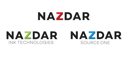
Nazdar’s refreshed logos features intentional design elements, including the Z element that remains in the logomark but refreshed in a way that keeps it within the bounds of the word. It shows the logo’s simplicity as a whole; that it is one strong piece. The Z is divided into two shades of red for two reasons: The first and primary meaning is to show one Z made up of two parts – manufacturing and distribution. Without both, the Z would not be whole. The second meaning is a nod to the 100th Anniversary—the two parts of the Z mimic arrows.